Logo
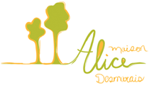
Explanation of the logo:
The green color represents the hope for a better future, better situations and positive change.
The orange color evokes the good mood and the joy of living.
Alice: the calligraphy is a signature by hand to remind us that Alice-Desmarais’ House uses a human and personalized approach, adapted to each woman and child who benefit from the services of the resource. The work of the resource workers is human and personalized.
Trees: this represents the adult and the child. It also speaks about the fact that the tree must be rooted deeply to be strong, to be firmly anchored. By passing through Alice-Desmarais’ House, we anchor our roots deeper, so the tree will bring more fruit. We become firm. We can continue our journey later and be sturdier. It’s a bit like what we do at the shelter: become stronger.
The orange and the green of the trees make it possible to wish that our hopes become tangible, that they turn into actions, so that we see the light at the end of the tunnel.
What inspired the designer, how the creative process has happened?
“My creative process for the Alice-Desmarais’ House logo began with the dedication and compassion of Ms. Alice Desmarais for others, especially the women in difficulty at the time. I then continued my reflections on the problems that women and their children could run into today, who would eventually benefit from the services offered by the House … and to arrive at a simple and representative image, I imagined that the wishes of each of them were realized thanks to their sojourn at Alice-Desmarais’ … ”
Designer
